 how-to
How to Design a Restaurant Subscription Landing Page
Table of Contents
- What Makes a Restaurant Subscription Landing Page Different
- Essential Elements Every Restaurant Subscription Landing Page Needs
- Restaurant Landing Page Examples That Drive Subscriptions
- Crafting Restaurant Membership Landing Page Copy That Converts
- Restaurant Landing Page Best Practices for Mobile and Desktop
- Restaurant Landing Page Templates and Customization
- Testing and Optimizing Your Restaurant Subscription Landing Page
- Frequently Asked Questions
Last Updated: October 8, 2026
What Makes a Restaurant Subscription Landing Page Different
A restaurant subscription landing page is a dedicated web page built to convert casual diners into paying members who receive exclusive perks and recurring benefits.
The difference is psychology.
At The Regulars Club, we've helped independent restaurants build subscription programs that turn occasional customers into loyal regulars. The best landing pages do one job: getting the right person to click join.
Essential Elements Every Restaurant Subscription Landing Page Needs
A strong restaurant subscription landing page includes several non-negotiable pieces. Without them, conversion suffers.
Clear Value Proposition Above the Fold
Your value proposition sits at the very top and answers the question every visitor has: "What do I get if I join?" Skip clever wordplay.
GOOD: "Join our membership and get $50 in free food every month, plus exclusive BOGO deals at our location."
NOT: "Experience the ultimate dining community with curated rewards."
Your value prop should include:
- The specific benefit (free food, discounts, exclusive access)
- The dollar amount or savings when possible
- Why it matters to a regular customer
Place this in your headline and subheadline. Make it impossible to miss.
Benefit-Focused Copy That Converts
Every word should answer one question: "What's in it for me?" Too many pages list features instead of benefits. Features describe what the membership includes; benefits explain how it improves the customer's life.
FEATURE: "Access to our mobile app with exclusive offers."
BENEFIT: "Check your phone, see a deal you love, and grab dinner at your favorite spot without paying full price."
Write copy that shows what membership feels like, not just what it includes.
Visual Trust Signals and Member Testimonials
Trust signals show visitors that people like them have already joined and benefited. The most powerful are member testimonials.
Include 2-4 short testimonials from real members. Each should mention:
- What they expected before joining
- What surprised them (in a good way)
- A specific result they got
STRONG testimonial: "I thought I'd save a little money. Instead, I'm eating out more often because the discounts make it feel affordable.
WEAK testimonial: "Great membership! Highly recommend!"
Real names and photos matter: "Sarah M., Local Marketing Manager" carries more weight than "Anonymous." Use member photos if you have them; otherwise a first name and brief description works.
Restaurant Landing Page Examples That Drive Subscriptions
Real examples show what works.
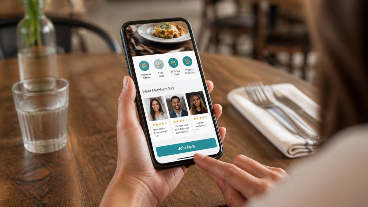
The strongest pages lead with a single bold offer, the one thing that matters most to their target member.
Many successful pages use a two-column layout: benefits on the left, a signup form on the right, keeping the conversion action visible while you read.
Visual style varies by restaurant type, a casual pizza place might use bright colors, an upscale spot elegant typography.
How Strong Pages Package the Recurring Offer
Most competitors stop at layout. Pages that convert present the subscription itself as a product, often two or three tiers side by side, each with a clear billing frequency and a plainly stated per-period benefit.
Show the billing cadence next to the benefit, not buried in fine print, "Billed monthly" or "Billed annually" directly under the plan name. If you offer an annual option, show the per-month equivalent.
Presenting Price, Savings, and Limits Clearly
Pricing on a subscription landing page has three jobs: state the recurring amount, show what the member gets each period, and remove ambiguity about limits. A practical structure is:
- Recurring price, the amount charged each billing period, stated plainly.
- Per-period value, the benefit the member receives each cycle (for example, a set credit toward food, a standing discount, or a set number of included items).
- Limits and terms, how many times the benefit can be used per period, whether unused value rolls over, and any blackout windows.
A common pattern is to show a simple savings comparison: the recurring price on one side, the estimated value of the benefits on the other, and the difference labeled as member savings. Keep the estimate grounded in your own menu economics, don't inflate it, because members will notice the first month.
Terms That Build Trust Instead of Doubt
The best pages answer the questions that stop a purchase: Can I pause? Can I cancel? What happens to unused benefits? State your cancellation policy in plain language near the plan cards, not only in a linked terms page.
Show upfront what membership costs and what happens next. If someone can't tell whether they'll be charged monthly, yearly, or once, they won't convert.
The Subscription Conversion Journey
A subscription landing page isn't a single click, it's a path. The strongest pages make each step obvious: land on the offer, compare plans, select a plan, enter payment, confirm, and understand how to redeem the first benefit.
Map that path and count the clicks. If a visitor can't go from landing to confirmed member and know how to use their first benefit without leaving the page, tighten the flow.
Crafting Restaurant Membership Landing Page Copy That Converts
The words you choose determine whether someone joins or leaves.
Lead With Member Benefits, Not Features
Members don't care about "advanced POS integration" or "real-time offer management." They care that they save money, get treated special, and support a restaurant they love.
Start every section by answering: "Why does this matter to a member?"
Your headline should promise a benefit:
- "Join and get $50 in free food this month"
- "Members save an average of $15 per visit"
- "Get exclusive deals your non-member friends can't access"
Then explain what they need to do to get that benefit.
Address the Real Objections Diners Have
Every prospect has doubts. The best landing pages answer them directly.
Common objections from potential members:
- "Will I actually use this enough to break even?"
- "Is it a hassle to show my membership when I pay?"
- "What if I don't like the restaurants in the program?"
Address these head-on: add a short "How It Works" section, include your cancellation policy, and list a few partner restaurants. If you're building a Restaurant Membership Program or exploring VIP Dining Memberships, these same objections apply, answer them directly on your page.
Restaurant Landing Page Best Practices for Mobile and Desktop
Most people visit restaurant websites on their phones. Your landing page must work beautifully on mobile or you'll lose half your potential members.
Mobile-First Design and Checkout Flow
Design for mobile first, then adapt to desktop:
- Single-column layout that stacks vertically
- Large buttons (at least 48 pixels tall) that are easy to tap
- Minimal scrolling to see the main offer
The signup form should be short on mobile. Ask for email and password, nothing more; collect additional information later.
Test your checkout flow on actual phones. See if you can complete signup in under one minute. If it takes longer, you're losing people.
Call-to-Action Placement and Button Design
Your main call-to-action button should appear multiple times, strategically placed.
Place it:
- In the header (sticky, so it stays visible when scrolling)
- After your main value proposition
- At the end of your testimonials
Use consistent button text: "Join Now," "Become a Member," or "Sign Up." Avoid vague language like "Learn More."
Button color matters. Use a color that contrasts with your background; green and teal typically convert well. Test different colors if you have the traffic.
Restaurant Landing Page Templates and Customization
You don't need to build from scratch. Many website builders offer restaurant-specific templates you can customize for your membership program.
When choosing a template, look for these features:
- Mobile-responsive design built in
- Testimonial sections
- Pricing display
Customize the template by:
- Replacing placeholder text with your actual membership offer
- Adding real photos of your restaurant and members
- Changing colors to match your brand
The template is a starting point, not a finished product. Spend time on the copy. That's where conversions happen.
Testing and Optimizing Your Restaurant Subscription Landing Page
Once your page is live, your work isn't done, the best-converting pages are tested and improved over time. For a subscription page, "conversion" means a member who stays, redeems, and renews.
Track Subscription Metrics, Not Just Page Metrics
Start with the basics, then go deeper:
- How many people visit the page
- How many start the signup process
- How many complete signup
Those tell you whether the page works. To know whether the subscription works, add:
- Plan selection rate, which tier visitors choose, and whether one tier dominates or confuses.
- Checkout completion rate, how many who pick a plan finish payment.
- Redemption rate, how many members actually use their benefit in the first period. A member who never redeems is a member who will churn.
If 100 people visit but only 5 complete signup, you have a conversion problem. If 50 complete signup but 30 cancel after a month, you have a retention problem, usually a landing-page promise problem. Building Recurring Revenue for Restaurants depends on both strong landing-page conversion and strong member retention, so track both metrics closely.
Diagnose by Where the Drop-Off Happens
Common fixes map to specific symptoms:
- If people leave without scrolling, your headline isn't compelling.
- If people scroll but don't click the button, your value proposition isn't clear.
- If people start signup but don't finish, your form or checkout is too long.
Test One Variable at a Time
Test one change at a time: change your headline, run it for a week, measure results, then try another. Small improvements add up.
For subscription pages, the highest-leverage tests are usually:
- Plan presentation, two tiers vs. three, or monthly vs. annual framing.
- Price framing, showing the recurring amount alone vs. showing it next to the per-period benefit.
- Terms placement, cancellation and pause language near the plan cards vs. only in a linked policy.
The best restaurants treat their landing page like their menu, refining it based on what customers respond to.
Frequently Asked Questions
What should a restaurant subscription landing page include?
A strong restaurant subscription landing page needs a clear headline explaining the member benefit, high-quality photos of food and the dining experience, a list of exclusive perks (discounts, special offers, monthly rewards), member testimonials or reviews, frequently asked questions addressing common concerns, and a prominent call-to-action button for sign-ups.
How can a restaurant subscription landing page encourage visitors to join a membership?
Focus on what members actually gain: exclusive discounts, free items, priority access to new menu items, or monthly surprise rewards. Use specific examples (e.g., 'Members get a free appetizer every month') rather than vague promises. Include real member testimonials that show how the membership has enhanced their dining experience. Display a clear comparison showing the value members receive versus non-members. A limited-time offer or bonus for new members also creates urgency and drives sign-ups.
How should a restaurant subscription landing page work on mobile?
Mobile visitors should see your headline and primary benefit within the first screen without scrolling. Use a single-column layout, large touch-friendly buttons (at least 48 pixels tall), and readable font sizes (16px minimum for body text). Simplify the sign-up form to collect only essential information: name and email. Test the checkout flow on actual phones to ensure it's fast and intuitive.
What makes a restaurant membership offer easy to understand?
Clarity beats cleverness. State the membership benefit in one sentence at the top of your page (e.g., 'Join for exclusive monthly rewards and member-only discounts'). Break benefits into a short bulleted list with specific examples. Avoid jargon or complex terms. Use contrasting colors to highlight your call-to-action button. Answer the three questions every visitor has: What do I get? How much does it cost? How do I join? A simple, scannable page layout helps visitors understand your offer in under 10 seconds.